
Redesign
Redesign OEC’s Document Feature
Duration
Nov 2025 - Feb 2026
Skills
UI Design, UX Design
Tools
Figma
Team
1 Designer · 2 System analyst (SA) · 1 Front-end developer
My Contribution
Collaborated with the System Analysts in defining and documenting the current user flow
Redesigned the UI to meet the latest design guidelines and ensure full responsiveness
Optimized the Figma file by restructuring the page layout and eliminating redundant frames
Intro
A legacy feature that needed a redesign
The Document module was a legacy feature that hadn't been fully updated since the team first rolled out the design guideline in 2024. The team only had the bandwidth for a visual refresh, meaning core elements like the 'upload' flow were plagued with usability issues and felt inconsistent with the rest of the site as the design continued to evolve. This project focused on fixing those problems and updating the module to be fully compliant with our current design guidelines.
Challenge
Messy, unintuitive, and interruptive
01
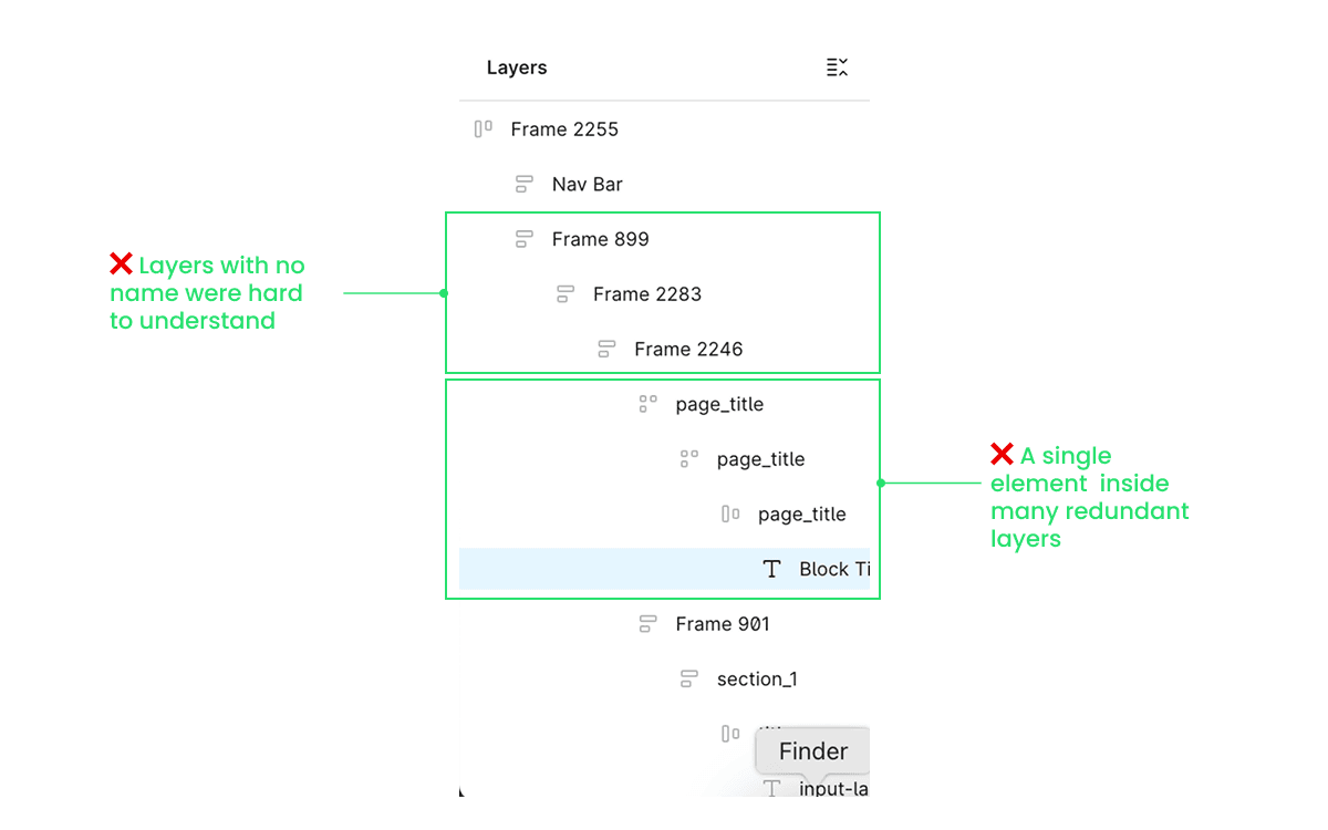
Messy Figma layers
The legacy design files contained multiple layers of redundant frames, which made selecting the right components extremely difficult. Designers often had to click through frames to arrive at the desired layer.
02
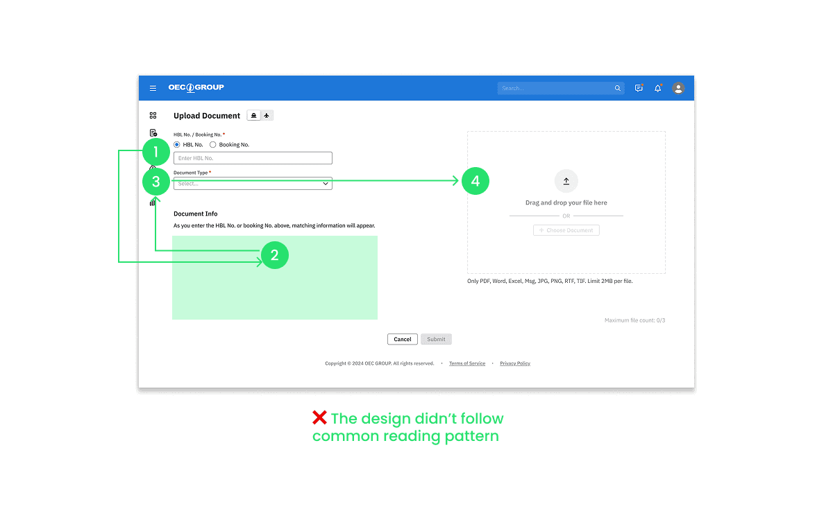
Unintuitive reading path
The old design split the screen into two sections, forcing users to move their eye from the top left, down to the bottom left, and then across to the top right.
This conflicted with common reading patterns, and made the instructions in the empty state hard to locate, leaving the users confused.
03
Interruptive flow
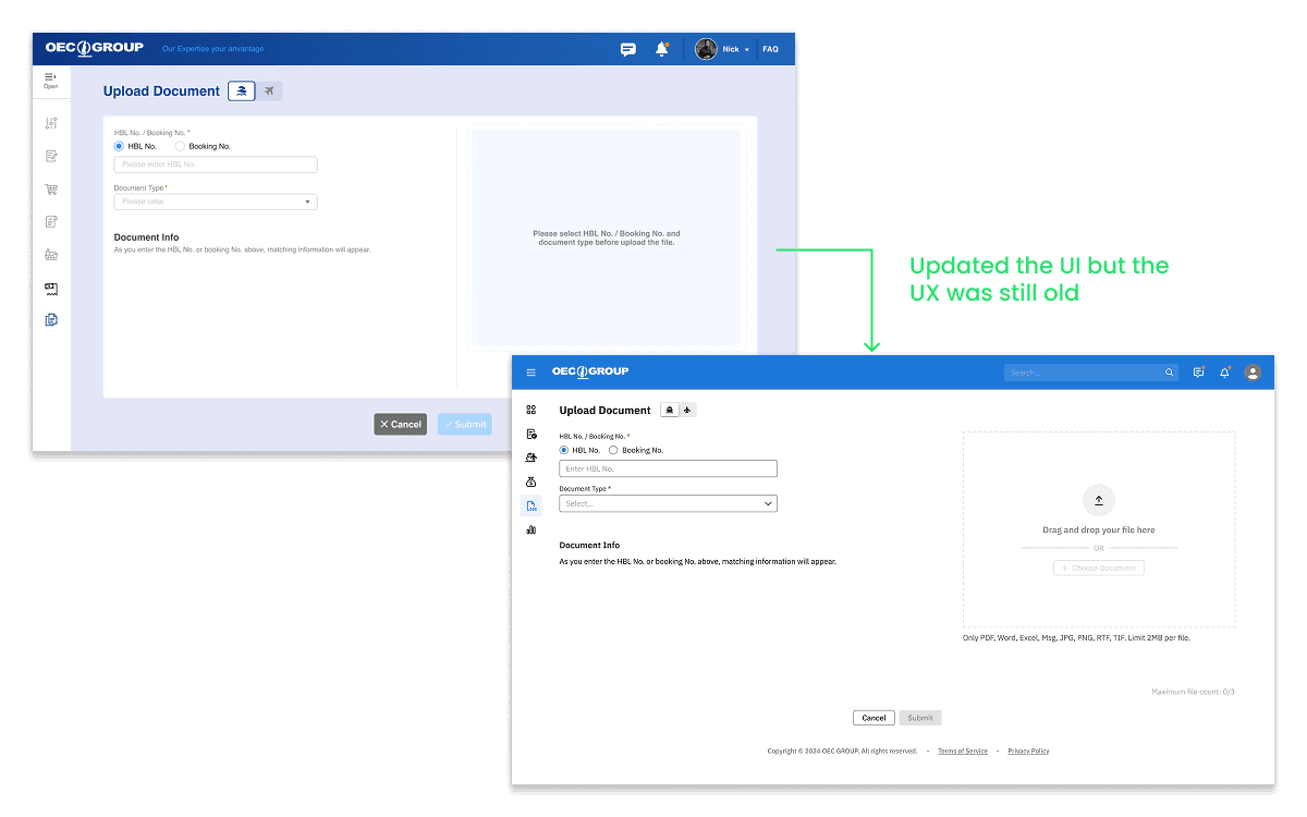
When users click on the ‘Upload’ button, they would be guided to a new page where they can search for the booking number and upload files to the corresponding booking. When the users were already in the Document feature, this wouldn’t cause much of an issue. However if they were originally in the Booking or Shipment feature, they’d still be redirected to a new page and it was difficult to return to where they were. This interrupted the flow and caused them to lose context.

Design solutions
Removed unnecessary frames
Besides improving the end-user experience, a key goal was to make the Figma file easy for other designers to navigate. I simplified the file hierarchy and ensured all layers were named. I simplified the hierarchy of the file and made sure to name all the layers.
A template that improved the workflow for designers
When designers copied components from other screens, it’s common to not select the root layer, causing the new screen to have redundant layers, and the situation could get worse for subsequent screens.
To solve this problem, I extracted the most fundamental screens for different user flows in the document feature and created a ‘template’ section. Future designers can now make changes based on these templates without carrying over any ‘dirty frames’. It also saves them from manually searching through the Figma file to find the screens they need.

Reduce interruption with dialogs
Since the process of uploading documents is relatively simple, a single dialog box is sufficient to contain all necessary information. After discussing with the PM, I moved the upload flow from a dedicated page to a dialog. This update allows users to remain on their current screen and maintain context, which is particularly valuable when they are using the Booking and Shipment features.
A linear reading order
While moving the information to a dialog, I also changed the two-column layout. Now the user can read from the top to the bottom and easily locate the instruction at the top of each section.

More challenge
Poor feedback experience
Midway through the project, me and the SA noticed that there could be many reasons that make the upload process fails. Yet we didn’t provide enough clues for the user to identify the causes as well as how to solve the problems. Under some scenarios, the system would even just show a ‘?’ to the user.
Collaborated with the development team while writing the messages
To improve the feedback experience, I first worked with the front-end to understand where each error message came from. Knowing whether it was triggered by the frontend, or returned from the backend allowed me to write the right messages and determined the detail I needed to provide. I then went on to choose the UI component that best carried the message.

Validation
Since this is a change request I initiated, I held several design walkthroughs within the design team and externally with the system analysts. I’m glad that the alignment process went well and my proposal has positively impacted the team as well as product.

Design team
The template works and we decided to have a template section for each design file, keeping only the key screens of the user flow. After finishing a design change, we will also update the template to ensure it remains up to date and clean.

Product
By proactively asking for feedback from the SA and the developer. I was able to keep feasibility and constraints in mind from the start. The development is currently underway, and the new design is set to launch in late April.