This page is under construction, come back later for the full story!
New Product
Fixing Gaps in User Flow for the MVP
Duration
Jul 2024 - Dec 2024
Skills
Product Roadmap, UX Design, Design System
Company
Flikshop
Teams
1 Designer, 1 PM, 2 Developers

My Contribution
Standardized the fragmented UI into a scalable, lightweight design system to reduce design debt
Revamped the end-to-end product workflow to deliver a seamless user experience under technical constraints
Background
Connecting families to incarcerated people
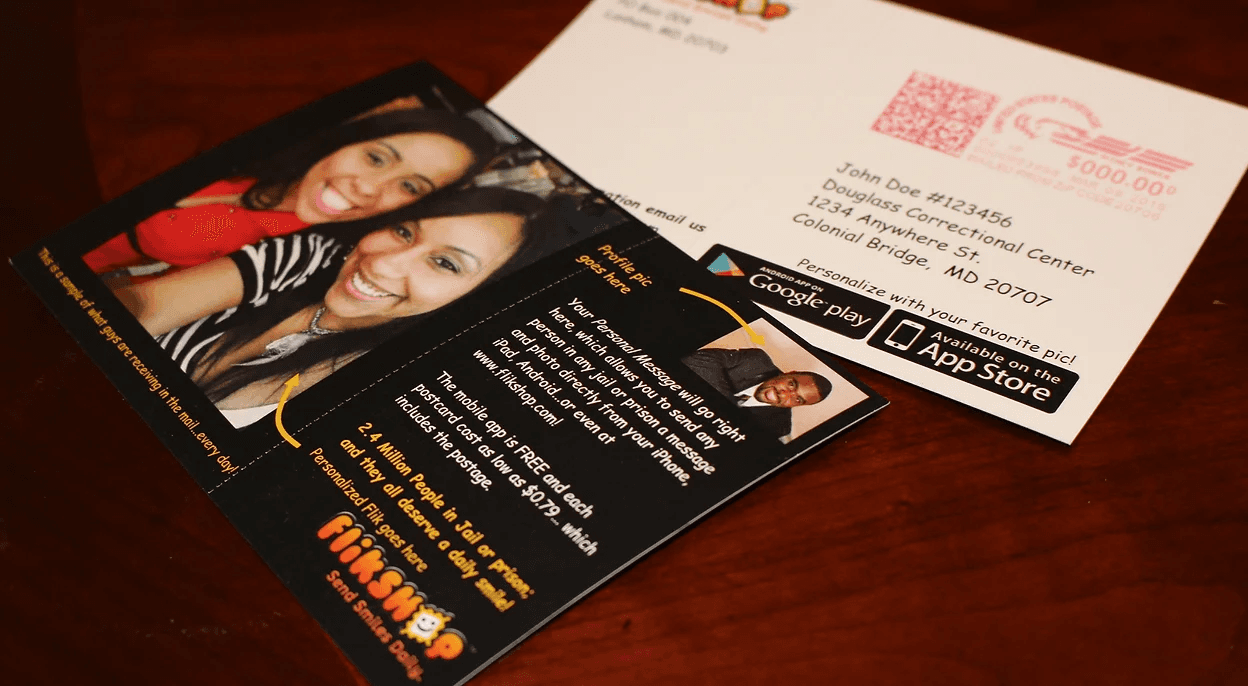
To reduce recidivism, Flikshop connects families and friends with their incarcerated loved ones through mail. Without access to the internet, incarcerated people are basically detached from their social support and the ever-changing world, making it harder for them to reenter society. That's why Flikshop has a mobile app that allows users to send postcards and photos to people inside.
The Product
Flikshop Neighborhood
Having built connections with more than 85,000 incarcerated people in jails and prisons, Flikshop's next goal was to leverage these relationships and expand the influence by bringing community, educational, and second chance hiring programs in.
To prepare people for release, Flikshop is building a Neighborhood with shared resources. On the other hand, Flikshop was also helping organizations to find their targeted audience.

Challenge
The problems with the old prototype
When I joined the project, the product had already been designed and largely implemented. The frontend, backend logic, and data schema were already in place based on the previous design.
Yet the CEO tried the prototype and found himself not being able to finish the basic task. That was why he wanted me to improve the experience while minimizing engineering impact.


Goal
Project goal
The CEO's goal was to improve the existing product with minimal engineering effort so the MVP could launch as soon as possible.
I believed user feedback should not wait until after launch. Even a functional prototype could reveal valuable insights. Since the team preferred to postpone user interviews until the product felt more complete, I focused first on improving issues that could be addressed with established UX patterns and still advocated for chances to talk with the users.
Process
How I approached the problems
01
UI audit and standardization
I first separated visual design issues from usability problems. Although the goal was to minimize visual changes, the existing interface lacked consistency and relied heavily on one-off components. So a design library that is reusable will be much needed.
02
Identified quick win for UX issues
Before involving users, I first addressed the issues that were evident through heuristic evaluation and competitor analysis.
I reviewed the design and flagged issues such as unclear visual hierarchy, fragmented interaction flows, and missing system feedback. These are the quick wins that can be solved by applying established UX principles before investing in further research.
03
Mapped out complex workflow
For issues beyond immediate heuristic fixes, I mapped the user flow into flowchart and wireframe for a team deep dive. These visuals turned our vague ideas into something concrete, and also made it much easier for me to catch a few missing pages early on.
04
Design and iteration
In this stage I brought in the components from the design library and created high-fidelity designs. During this stage, I proactively collaborated with the developer to ensure the design could work under technical constraints and stayed aligned with the existing implementation.
05
Talked with the user
After some iteration, the product’s improvement was really starting to show. Seeing the progress, the CEO was fully on board and connected us with three potential users for interviews. While I could fix the usability issues, I still wasn't sure how to prioritize our development roadmap. These interviews were a huge turning point; they allowed us to validate our assumptions and prioritize features based on real user goals.
Design solution
What I learnt from other products
Each step at a time
The original design crowded every step of the campaign creation process into a single entry point, relying heavily on modal for every interaction.
This approach overwhelmed new users. Moreover, users couldn't easily grasp how different steps influenced each other, and the lack of clear feedback made the final outcomes of their actions difficult to track.
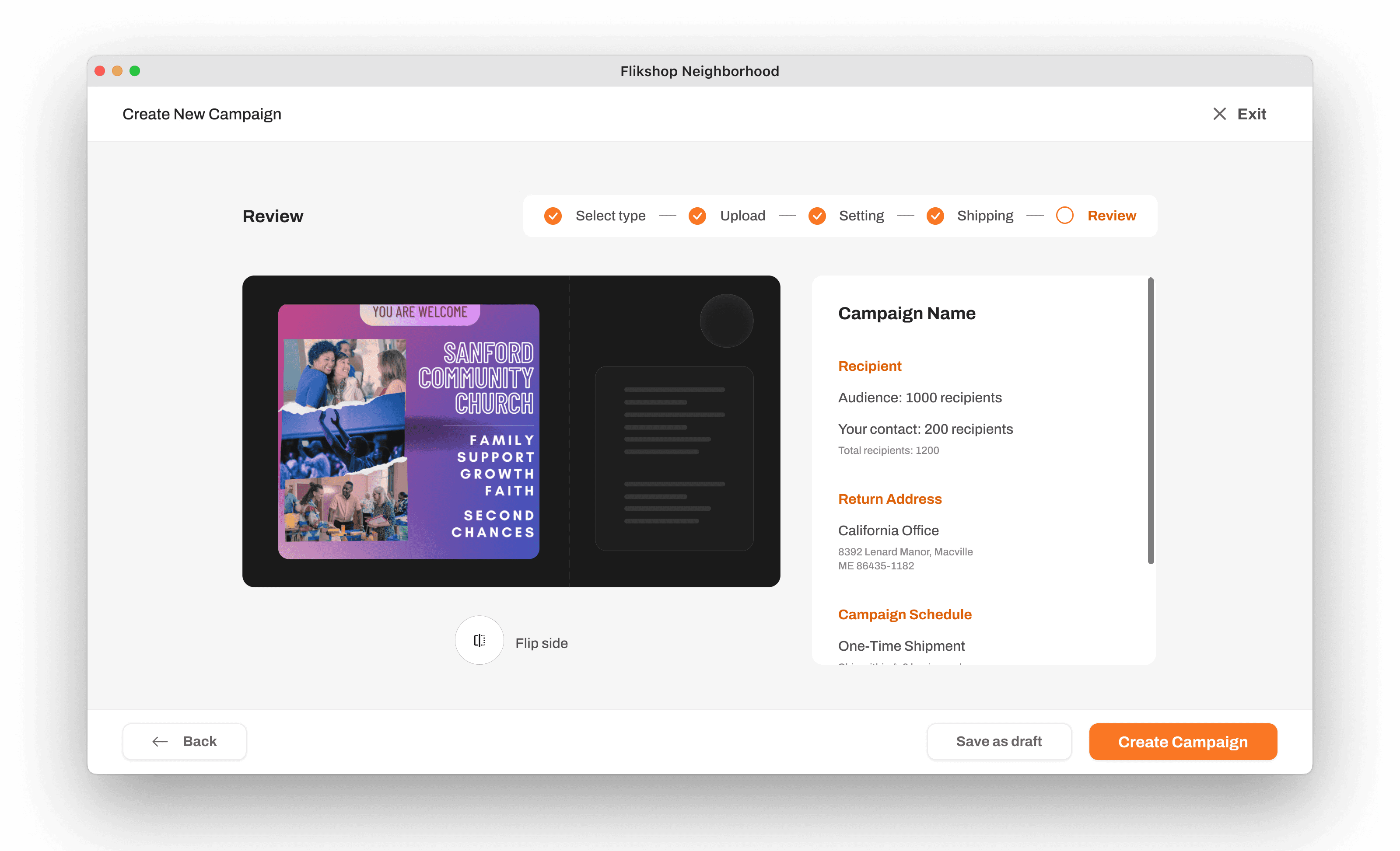
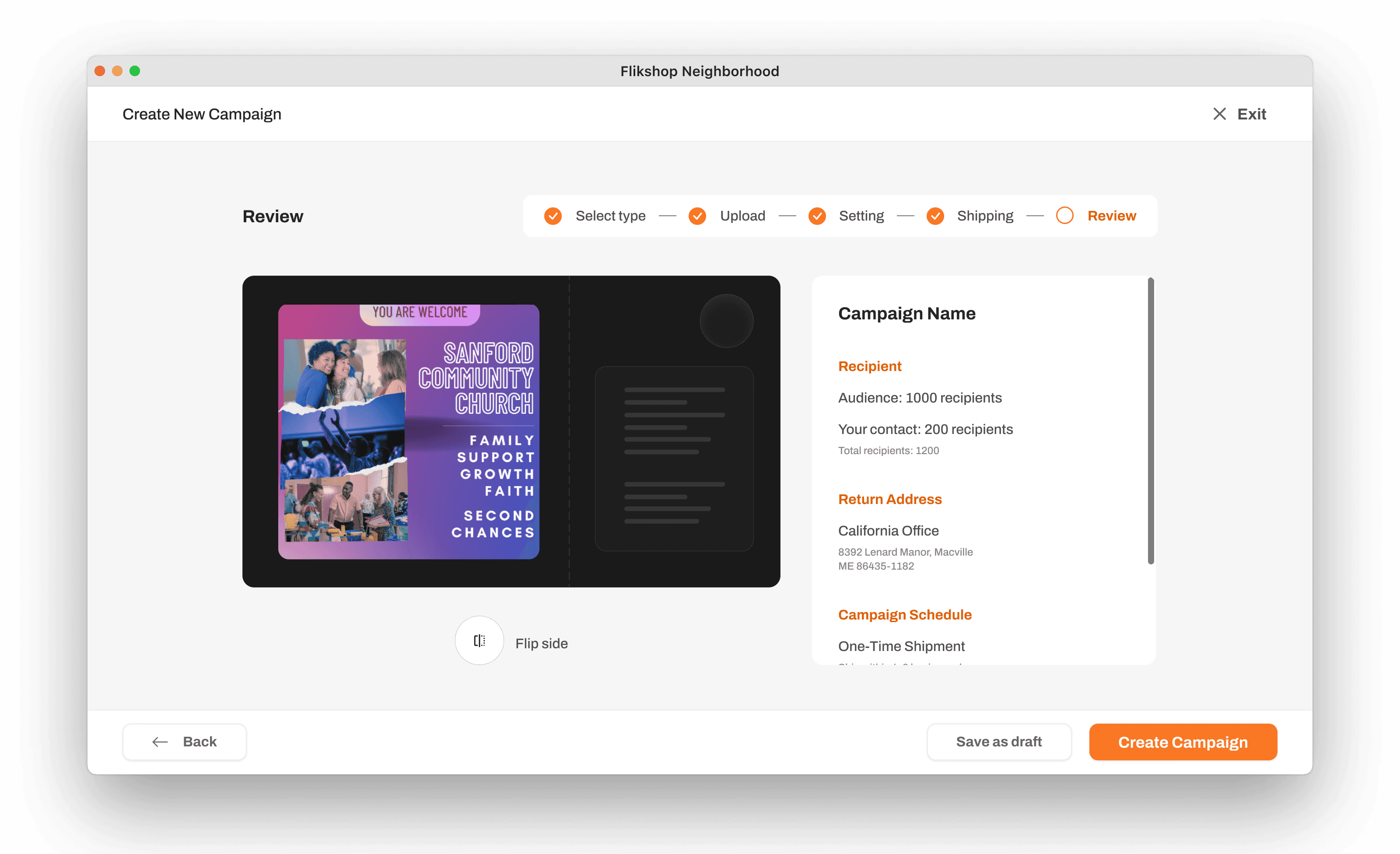
After researching how similar products handle online editing, recipient selection, and scheduling, I broke the ‘create campaign’ flow into four steps. I also added some guided prompts to help users navigate the process.
Let user be in charge
I noticed that most reference products show cost estimates upfront, which our original design lacked entirely. Initially, the CEO planned to bill users monthly, meaning users wouldn’t know their total spend until the bill arrived. This design offered no room for error or budget control.

To fix this, I introduced a 'Review' step at the end of the workflow. This allows users to double-check their campaign details and view an estimated cost breakdown before submitting, ensuring they remain in full control of their budget.

New UI for consistency and scalability
The previous design was built with many custom components that were used only once or twice, which would have made future maintenance unsustainable. I started by checking with the developer the frontend framework and learnt that he used Bootstrap. Therefore I quickly built a lightweight design system with an open-sourced Bootstrap component library.
Designing under technical constraints
A better way to create staggering mail
Initially, I aimed for more flexible delivery date options. However, the developer advised that changing the underlying schema would be too much effort. Because we lacked real-user insights at that time, he recommended sticking to the existing operational logic. The original interface was a confusing mix of a dropdown and an awkward slider. After iterating on a few options, I changed the design to three simple dropdowns with supporting text.
Be adaptive for slow API call
Beyond the data structure limitations, we also faced issues with slow API calls. To improve performance, I changed how users apply filters to minimize the number of requests sent to the server. In the new design, users select all their options first and then apply them all at once, which significantly reduces the wait time.
Reflection
Don't give up on advocating for chances to talk to the user
While heuristic evaluation and competitive research provided a strong foundation, I knew we still needed direct user input. Yet it was not until the CEO saw the tangible impact of our initial improvements that he began to support us in setting up interviews with potential users.
Connecting with users provided the missing pieces of the puzzle that we could not have gathered otherwise. Therefore, this experience taught me to never give up on advocating for opportunities to connect with users, even when it seems difficult.