
Booking Portal
Document Module Enhancement
Duration
Nov 2025 - Feb 2026
Skills
UI Design, UX Design
Company
OEC Group
Team
1 Designer · 2 System Analysts (SAs) · 1 Front-end Developer

My Contribution
Collaborated with System Analysts to define and document the existing user flow
Redesigned the UI to meet the latest design guidelines and improve readability
Rewrote system feedback to provide clearer guidance and established a reusable writing template
Intro
A legacy feature that needed a redesign
The Document module was a legacy feature that had not been fully updated since the team first rolled out the design guidelines in 2024. The team only had the bandwidth for a visual refresh, so the user flow was plagued with usability issues and felt inconsistent with the rest of the site as the design evolved.
This project focused on resolving those problems and updating the module to fully comply with the current design guidelines.

Problem
There were several issues…
Unintuitive reading path
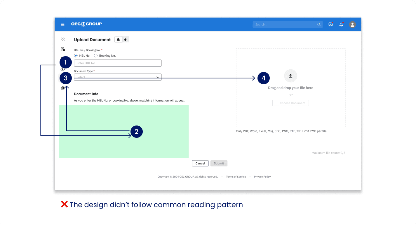
The old design split the screen into two sections, forcing users to move their eyes from the top left to the bottom left and then across to the top right.
This conflicted with common reading patterns and made the instructions in the empty state difficult to locate, leaving users confused.
The component library didn't support the use case
Back in 2024, our component library didn't include a dedicated file uploader component. As a result, the upload experience was built as a temporary solution, which brought several usability issues.
For example, although only the ‘+ Choose Document’ button appeared interactive, the entire drop zone was actually clickable, creating a mismatch between the visual affordance and the actual interaction.

Interruptive flow
When users clicked the ‘Upload’ button, they were taken to a new page where they could search for a booking number and upload files to the corresponding booking. When users were already in the Document feature, this did not cause much of an issue. However, if they were originally in the Booking or Shipment feature, they were still redirected to a new page, making it difficult to return to where they had been. This interrupted their flow and caused them to lose context.

Poor feedback experience
The SA and I noticed that the upload process could fail for many reasons. However, we did not provide enough clues for users to identify the causes or understand how to solve the problems. In some scenarios, the system simply showed users a ‘?’.

Design solution
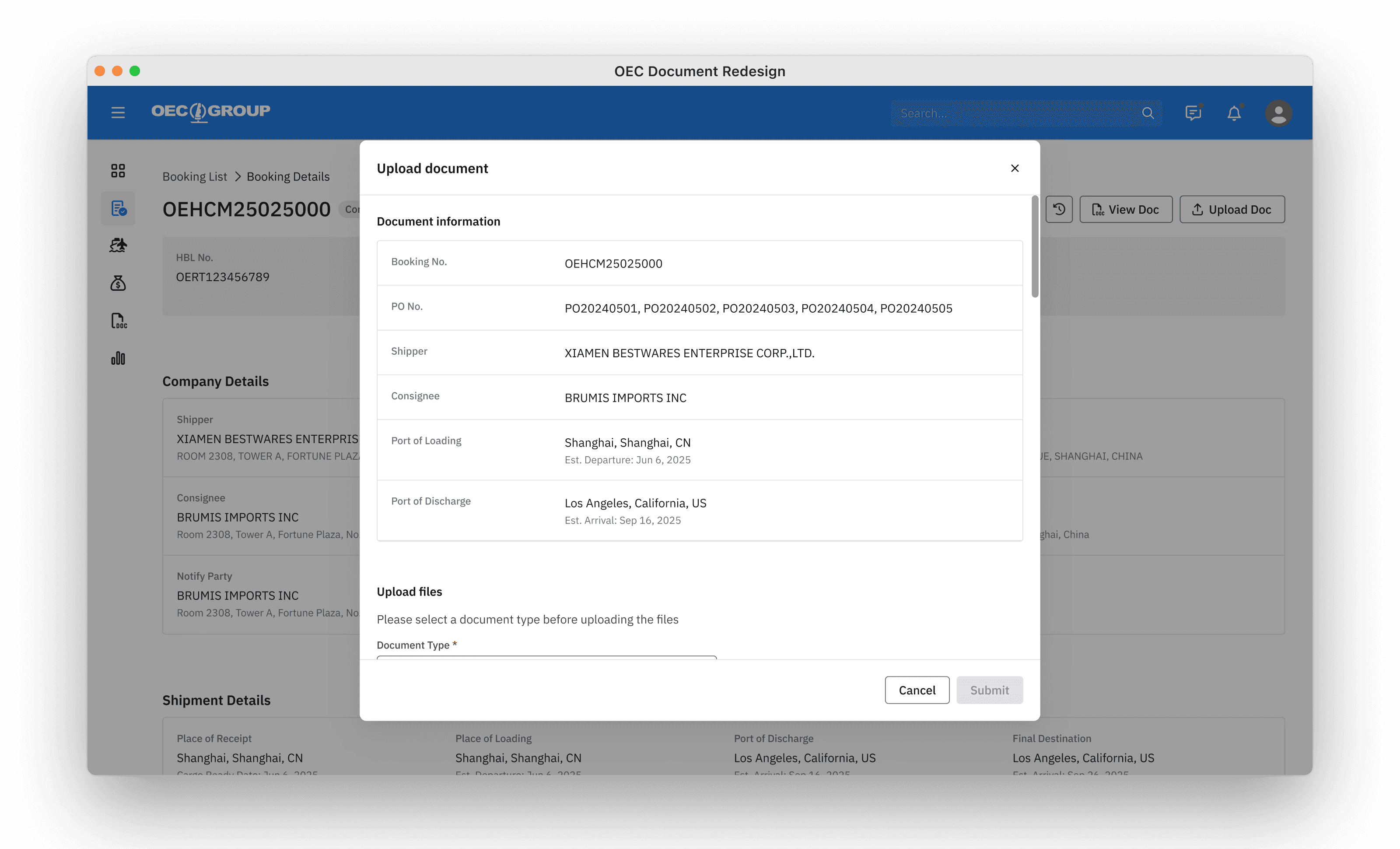
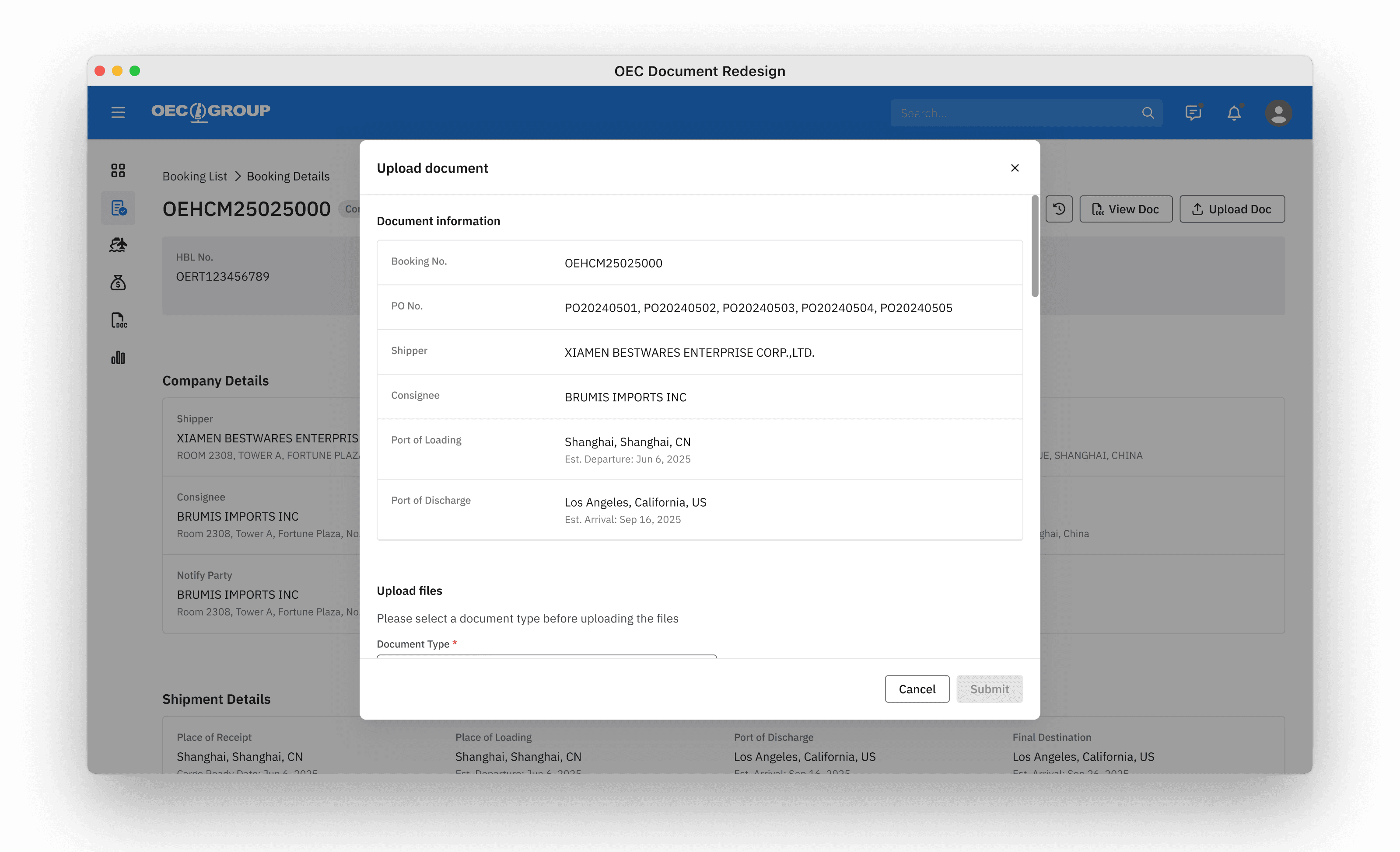
A linear reading order

New and reusable component
While designing the new file uploader, I treated it as a design-system component rather than a one-off feature. Knowing it would be added to our component library, I designed it to be flexible enough for different product contexts. It supported responsive layouts across various container sizes and accommodated different validation flows.

Reduce interruption with dialogs
Rewrote feedback based on context

Validation
This was a redesign project that I initiated, and I was glad that the SAs were supportive throughout the process. The new design went live successfully in May. To confirm the effectiveness of the changes, I followed up with the Sales and Customer Service teams through the SAs. The feedback was positive, as the frontline teams had not received any complaints about document uploads so far.